Sydney Airport
Role: IA, Design, Styleguide | Year: 2011 | Client: Sydney Airport | Agency: Reactive
Planning and managing time wisely
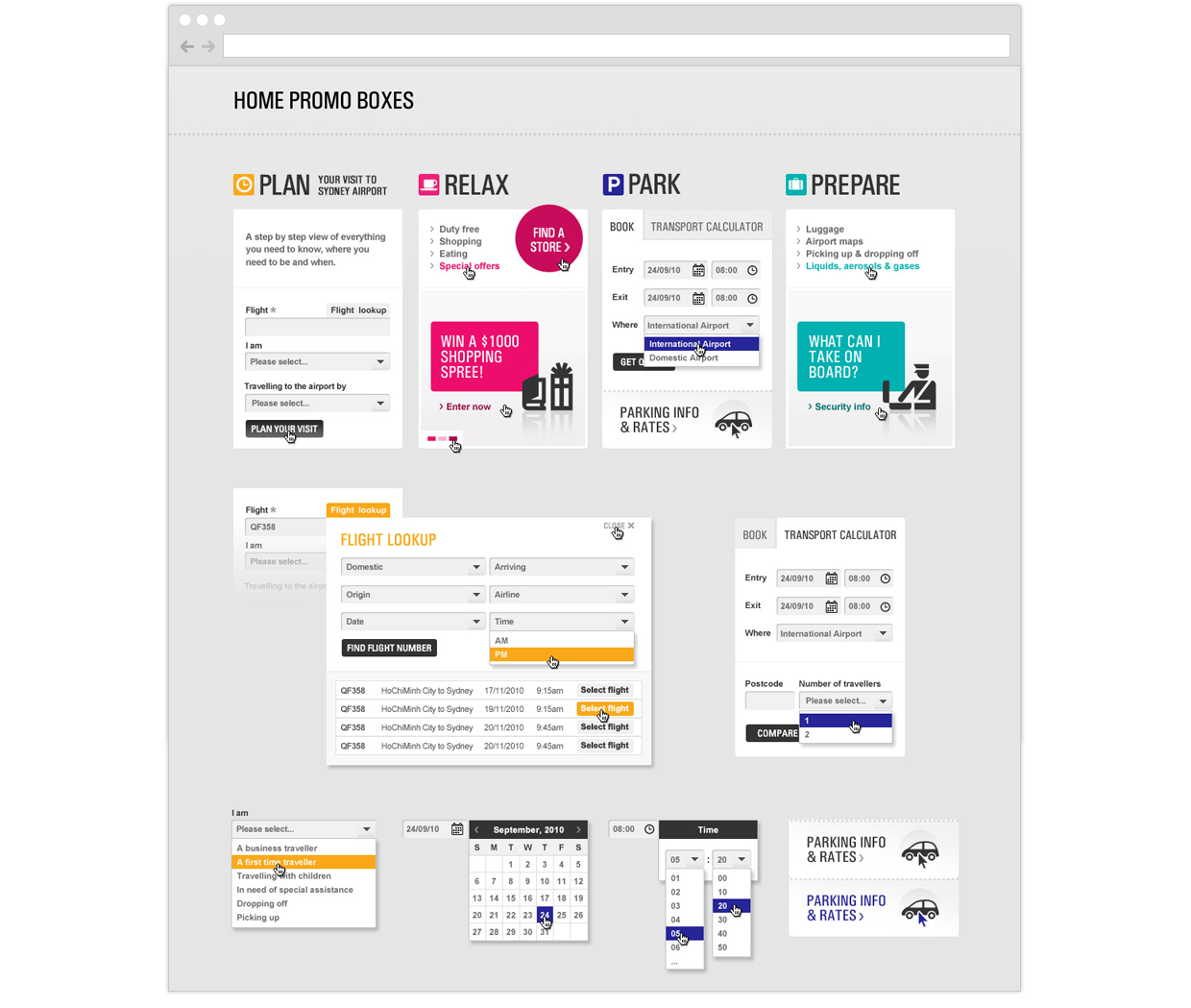
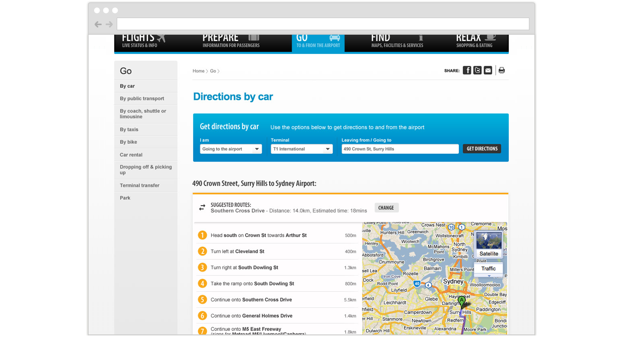
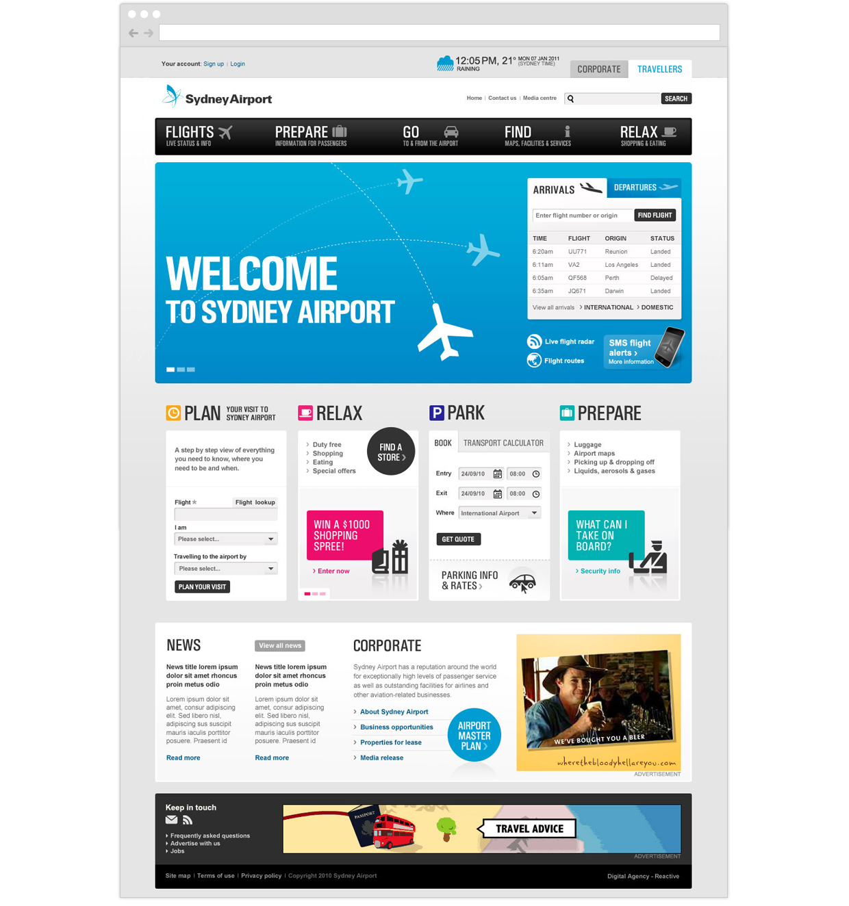
Business problem: Sydney Airport is the busiest airport in Australia. It handles more than 40-50 million passengers and 348k aircraft movements annually. As part of the website relaunch, the business wanted to provide useful online tools for their customers so they can plan and manage their trips to and from the airport. Travellers are excited about their upcoming trip, whilst family members or friends would be looking forward to reuniting with someone who is coming home. The journey to and from the airport is probably the least exciting part of the process; as there are often long queues and traffic to get to the airport. Our team focused on answering how might we make the trip more pleasant for customers and how might we help them make better use of their time?
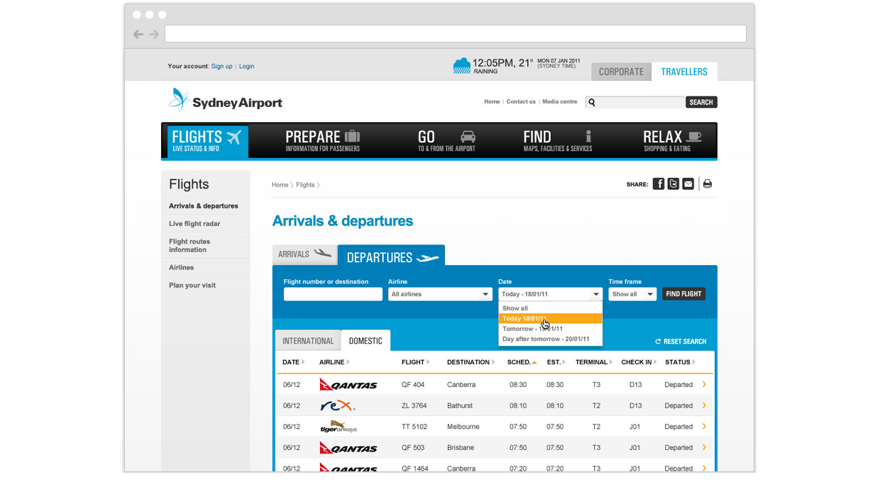
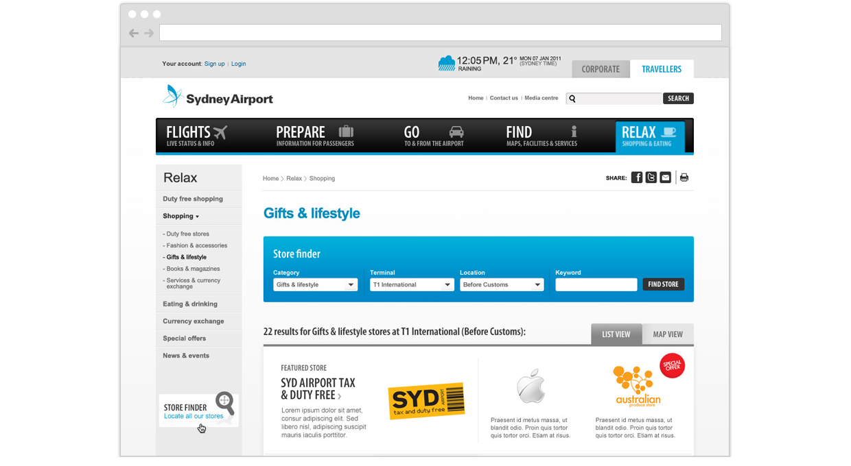
Solution: The key target audience are travellers, and the secondary target audiences are family members or friends who are going to the airport for pickups or drop-offs. A series of features were designed to help these people plan their day so they know what time to leave the house, or what they can do at the airport if they arrive early. Sydney Airport was one of the biggest projects I've worked on, there were more than 30 unique screens in total. We wanted to use a simple and minimalist approach, so we've used lots of icons and illustrations throughout the site. I worked on the IA, web styleguide and designs for this project.
