Financial Standard
Role: IA, Design | Year: 2017 | Client: Rainmaker Group | Agency: Six Black Pens
Improving website user experience
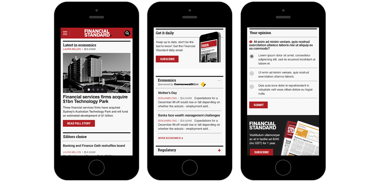
Business problem: Financial Standard is the publishing division of Rainmaker Group and is an essential hub for financial professionals. The website is made up of daily financial news updates, investment analysis, latest industry events and resource centre. The existing site was a few years old and the website was not mobile-friendly. Financial Standard offers banner advertising and sponsorships on their website, but banner ad sizes were bespoke and inconsistent with industry standards. Clients found this to be a frustrating experience - they cannot reuse any of their existing artworks and had to create bespoke artworks when advertising on Financial Standard.
Solution:
The first part of the project was to work with the stakeholders, marketing team and journalists to identify which are some of the issues they see in the existing site.
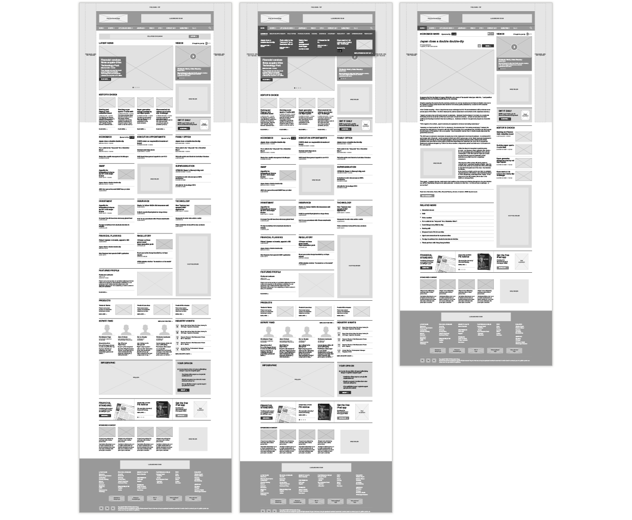
Based on their feedback, we developed a sitemap and wireframes to identify all the different page layouts and components that are needed for the new site.
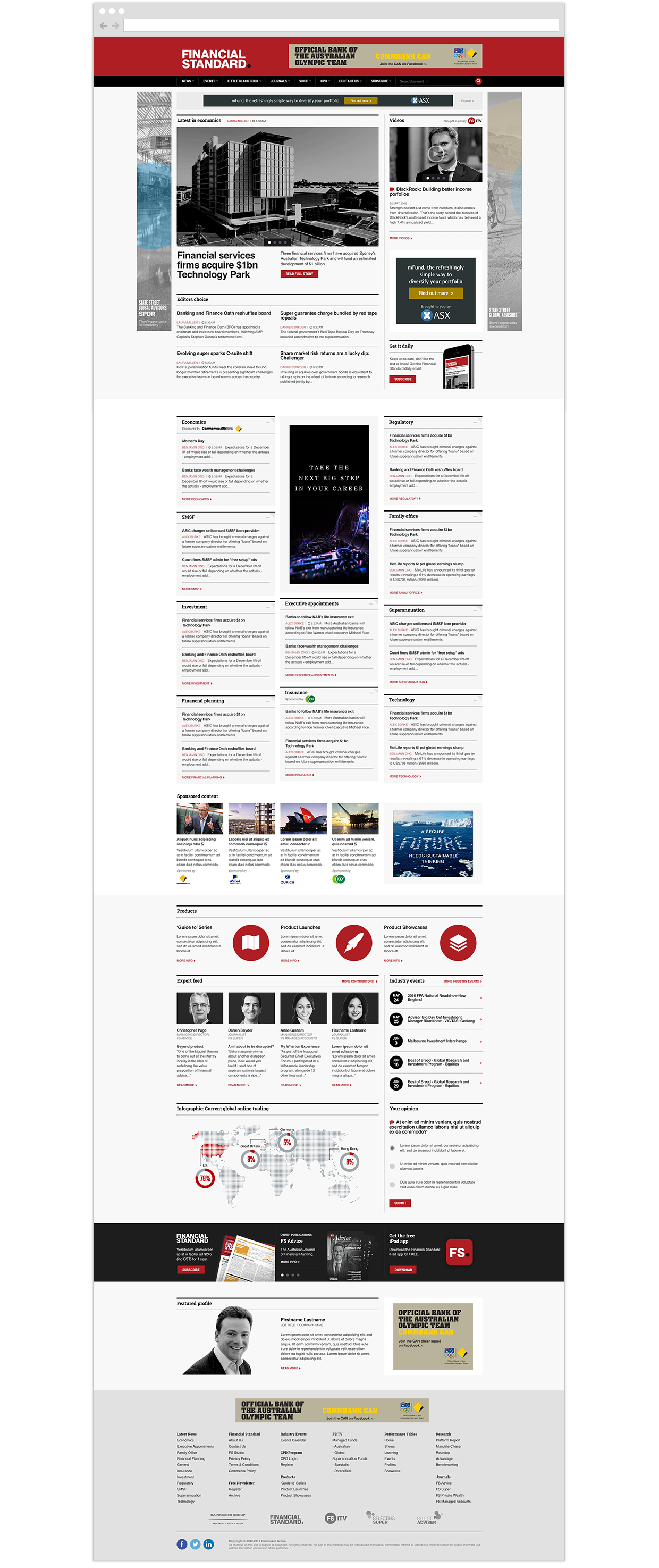
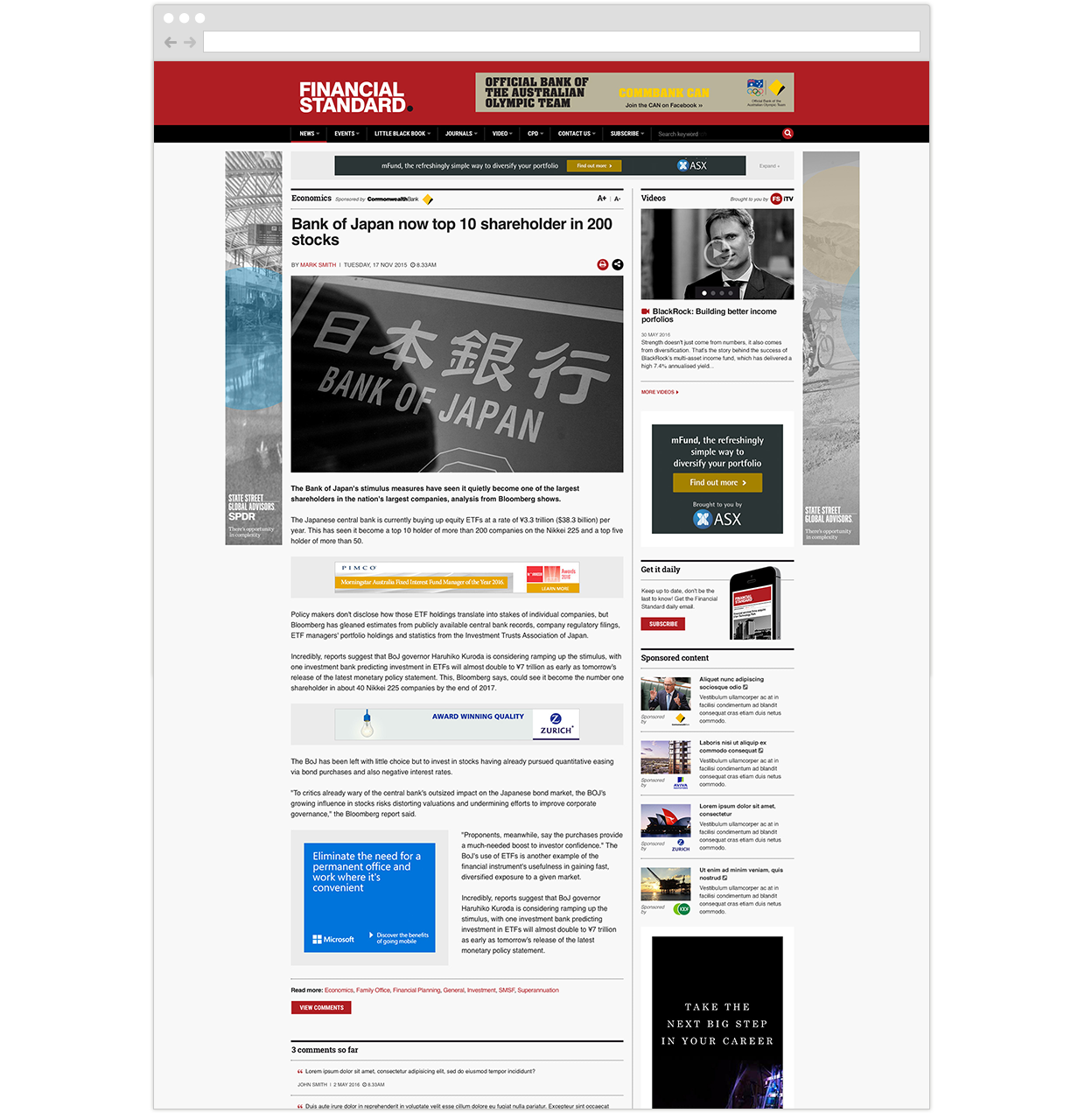
As part of the redesign exercise, we introduced standard-sized banner advertising and sponsored content areas.
To create a unique and tailored user experience for site visitors, we've designed a home page with customisable content.
All news categories (e.g. economics) on the home page can be moved around or hidden from view; these preferences are cached so that on returned visits, users will be able to read the most relevant news articles and of interest to them.
Apart from the website redesign, we also updated their email newsletters so they are now mobile responsive - they were given a design refresh so it's consistent with the look and feel of the new website.


