Choice Home Loans
Role: IA, Design | Year: 2015 | Client: Choice Home Loans | Agency: Six Black Pens

Delivering customised content to users
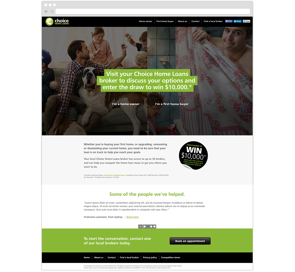
Business problem: Choice Home Loans needed a microsite for their spring campaign competition. There were 2 key target audience groups for the campaign: home owners and first home buyers. Both audience groups were equally important to Choice Home Loans, so they needed a simple website that directed users to the right content.
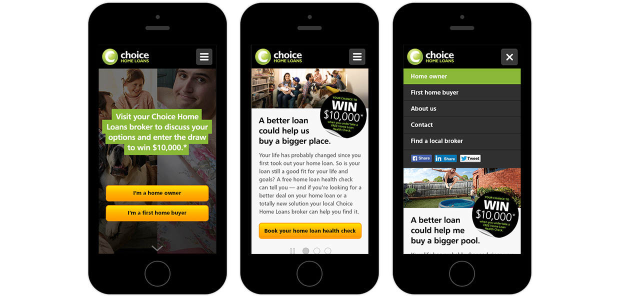
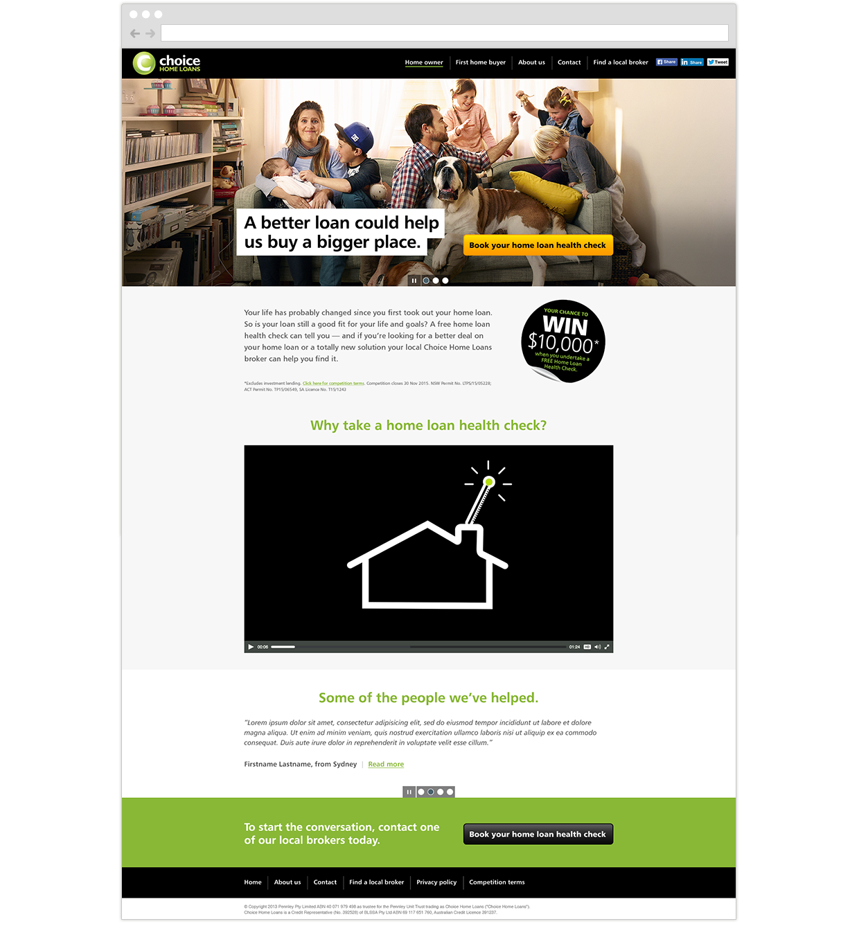
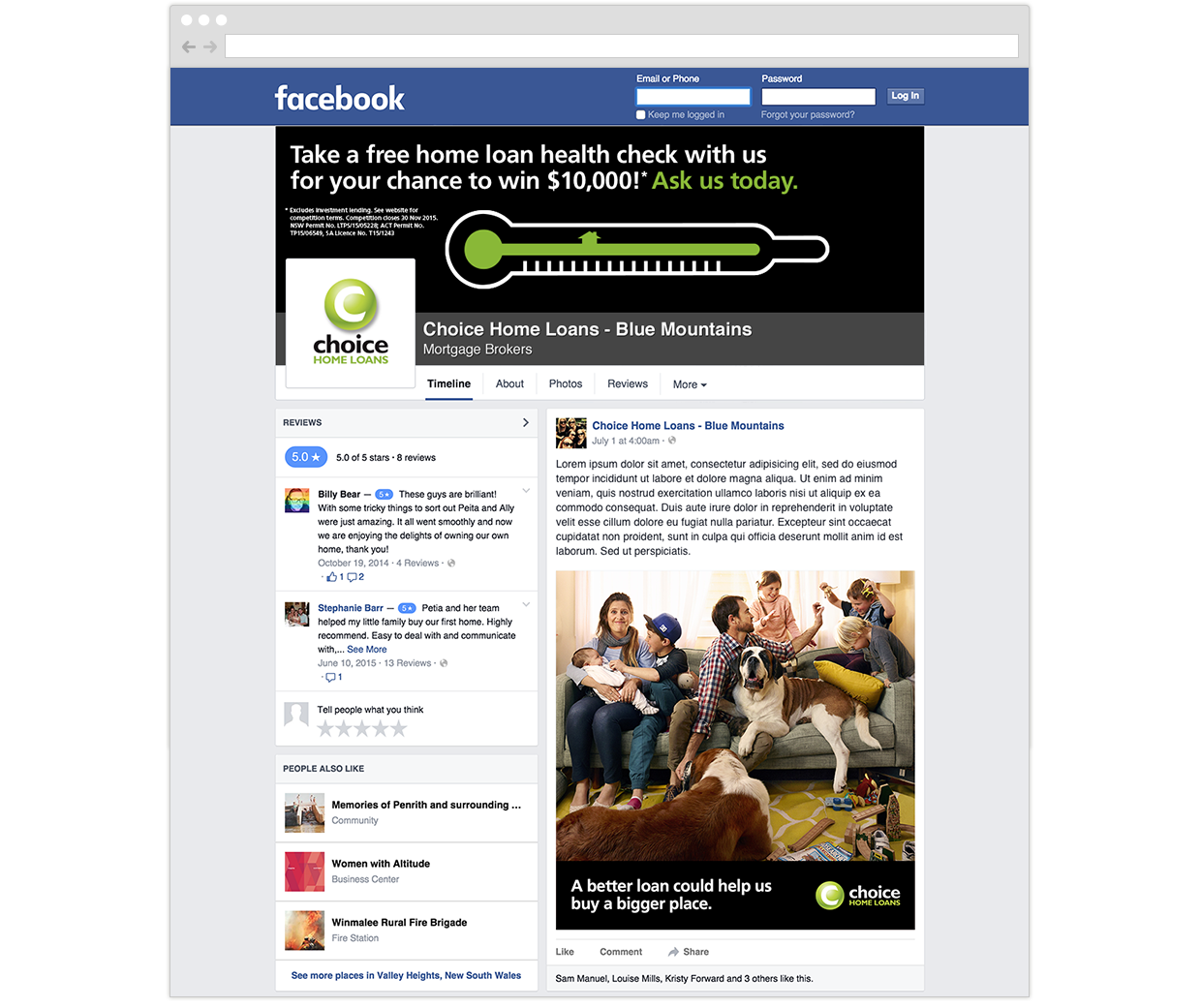
Solution: The landing page was designed with a large 50/50 split screen image on the home page. When the user hovers over the left side, it reveals a photo of a large family in a tiny living room which represents home owners. On the right side is a photo of a young man still living at home with his mum and this represents first home buyers. Users simply select the side they belong to and they will be redirected to a new page with relevant content. As part of the campaign, I worked on responsive microsite designs, banner advertising, emails and social media content.


